Why Is Typography Important in Web Design?
Learn why typography is crucial in web design, how it shapes readability, brand identity, accessibility, and conversions, and how to use type effectively on the web.
Priya Nair
Author
Typography is one of the most powerful yet underappreciated tools in web design. It is easy to think of type as merely the words on a page, but the way those words look, their size, spacing, weight, and style, profoundly shapes how visitors feel, what they understand, and whether they stay. Studies suggest that the overwhelming majority of information on the web is text, which means typography is not a decorative afterthought but the primary vehicle through which your message reaches people. This guide explores why typography matters so much and how to use it effectively.
Typography Drives Readability
The most fundamental purpose of typography is to make content easy to read. When text is legible and comfortable, visitors absorb information effortlessly. When it is cramped, too small, or poorly contrasted, they strain, skim, or leave. Because reading is the core activity on most websites, readability directly determines whether your message lands.
Achieving strong readability involves choosing legible typefaces, setting comfortable font sizes, maintaining generous line height, and limiting line length so the eye can track easily from one line to the next. These decisions, made carefully during website design, ensure your content is inviting rather than exhausting to read on any device.
Typography Establishes Brand Identity
Type carries personality. A clean geometric sans-serif feels modern and efficient, while a classic serif conveys tradition and authority. The fonts you choose communicate your brand's character before a visitor reads a single word. Consistent typography across your website and marketing materials reinforces recognition and builds a cohesive identity.
This is why typography should align with your broader visual system. Coordinated graphic design ensures your type choices harmonize with colors, imagery, and layout, creating a unified brand experience. When typography is consistent, your business feels polished and trustworthy; when it is haphazard, it feels careless.
Typography Creates Visual Hierarchy
Good typography guides the eye. By varying size, weight, and spacing, designers create a clear hierarchy that tells visitors what to read first, what is most important, and how content is organized. Headings, subheadings, and body text work together to structure information so people can scan quickly and find what they need.
This hierarchy is not just aesthetic; it is functional. A well-structured page with clear typographic levels helps users navigate content intuitively. It also supports search engines, which rely on heading structure to understand your content, making thoughtful typography a quiet contributor to digital marketing performance.
Typography Affects Emotion and Tone
Beyond legibility and structure, typography sets emotional tone. The right typeface can make a site feel elegant, playful, serious, or bold. This emotional resonance shapes how visitors perceive your brand and influences their willingness to engage. Type is a form of nonverbal communication that operates beneath conscious awareness yet powerfully affects impressions.
Choosing type that matches your message amplifies its impact. A financial services firm and a children's toy brand require very different typographic voices. Aligning tone with audience expectations, reinforced by compelling content writing, ensures your words and their presentation work together to persuade and connect.
Typography Influences Accessibility
Typography plays a major role in accessibility. Adequate font sizes, strong contrast, comfortable spacing, and clear letterforms make content usable for people with low vision, dyslexia, or other reading challenges. Poor typographic choices, on the other hand, can render content effectively unusable for a significant portion of your audience.
Accessible typography benefits everyone, not just users with disabilities. Larger, well-spaced text is easier to read on small screens, in bright light, or when tired. Building these considerations into front-end web development ensures your content remains readable across the full range of users and conditions.
Typography Impacts Performance
Fonts are assets that must load, and poor typography choices can slow a site down. Loading too many font families, weights, or styles increases page weight and can cause visible layout shifts as fonts swap in. These performance issues frustrate users and can hurt search rankings.
Efficient typography means limiting font families, loading only the weights you need, and using modern loading techniques to prevent flashes of unstyled or invisible text. Frameworks used in Next JS web development offer built-in font optimization that keeps typography fast and stable, preserving both performance and visual polish.
Typography and Conversions
Ultimately, typography affects your bottom line. Clear, readable, well-structured text guides visitors toward action, while confusing or unpleasant typography creates friction that costs conversions. The wording and presentation of a call-to-action button, for instance, can meaningfully change how many people click it.
Because typography shapes comprehension and emotion, it directly influences whether visitors trust you and take the next step. Investing in strong typographic design is investing in performance, which is why thoughtful type is a core part of any effective web development project rather than a finishing touch.
Best Practices for Web Typography
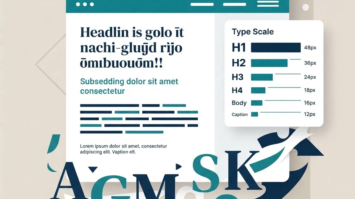
To use typography effectively, limit yourself to one or two complementary typefaces, using weight and size for variety rather than piling on fonts. Maintain strong contrast between text and background, and keep body text large enough to read comfortably, typically no smaller than sixteen pixels. Use generous line height and reasonable line length to reduce strain.
Establish a clear typographic scale so headings and body text relate harmoniously, and apply it consistently across the site. Test your typography on real devices and with real users, and ensure it meets accessibility standards. These disciplined practices, combined where helpful with artificial intelligence tools that assist with testing, produce typography that is both beautiful and effective.
Frequently Asked Questions
Why is typography so important in web design?
Typography is important because most web content is text, so the way that text looks determines readability, comprehension, and engagement. Typography also establishes brand identity, creates visual hierarchy, sets emotional tone, supports accessibility, and influences conversions. It is the primary vehicle through which your message reaches and persuades visitors.
How many fonts should I use on a website?
As a general rule, limit yourself to one or two typefaces. Use different weights, sizes, and styles to create variety and hierarchy rather than adding more font families. Too many fonts create visual chaos, slow performance, and dilute your brand identity, while a restrained palette looks cohesive and professional.
What font size is best for body text on the web?
Body text should generally be at least sixteen pixels to ensure comfortable reading, though the ideal size depends on the typeface and context. Pair an adequate size with generous line height and reasonable line length. Prioritizing readability across devices matters more than any single fixed number.
Does typography affect SEO?
Indirectly, yes. Typography shapes readability and content structure, and clear heading hierarchy helps search engines understand your content. Fast-loading, stable fonts improve performance signals, and readable text keeps visitors engaged. While typography is not a direct ranking factor, its effects on usability and structure support strong SEO.
How does typography impact accessibility?
Typography strongly affects accessibility through font size, contrast, spacing, and letterform clarity. Well-chosen typography makes content usable for people with low vision, dyslexia, and other reading challenges, and it improves readability for everyone in difficult conditions. Poor typographic choices can make content effectively unusable for part of your audience.
Conclusion
Typography is far more than decoration; it is the foundation of communication on the web. Through readability, brand identity, hierarchy, emotion, accessibility, and performance, typography shapes how visitors experience your website and whether they trust and act on your message. Treating type as a strategic design element rather than an afterthought elevates both the beauty and the effectiveness of your site. If you want a website where every word is presented with clarity and purpose, work with a professional website design team that understands the power of great typography.
Frequently Asked Questions
Why is typography so important in web design?
Typography is important because most web content is text, so the way that text looks determines readability, comprehension, and engagement. Typography also establishes brand identity, creates visual hierarchy, sets emotional tone, supports accessibility, and influences conversions. It is the primary vehicle through which your message reaches and persuades visitors.
How many fonts should I use on a website?
As a general rule, limit yourself to one or two typefaces. Use different weights, sizes, and styles to create variety and hierarchy rather than adding more font families. Too many fonts create visual chaos, slow performance, and dilute your brand identity, while a restrained palette looks cohesive and professional.
What font size is best for body text on the web?
Body text should generally be at least sixteen pixels to ensure comfortable reading, though the ideal size depends on the typeface and context. Pair an adequate size with generous line height and reasonable line length. Prioritizing readability across devices matters more than any single fixed number.
Does typography affect SEO?
Indirectly, yes. Typography shapes readability and content structure, and clear heading hierarchy helps search engines understand your content. Fast-loading, stable fonts improve performance signals, and readable text keeps visitors engaged. While typography is not a direct ranking factor, its effects on usability and structure support strong SEO.
How does typography impact accessibility?
Typography strongly affects accessibility through font size, contrast, spacing, and letterform clarity. Well-chosen typography makes content usable for people with low vision, dyslexia, and other reading challenges, and it improves readability for everyone in difficult conditions. Poor typographic choices can make content effectively unusable for part of your audience.
More from Technology
Continue exploring our curated collection of articles

SEO Computers: Choosing the Right Machine and Ranking a Computer Business Online
SEO computers explained two ways: the hardware specs that genuinely speed up SEO work, and how computer businesses rank for the searches that bring customers.

modern seo
How modern SEO actually works in the AI search era, based on 18 months of traffic data across 40 sites, including what stopped working and what never changed.

How AI Is Reshaping SEO and Content Marketing
Discover how AI is reshaping SEO and content marketing, from generative search and intent modeling to automated content workflows, E-E-A-T, and measurable results.